
Sketch, Oil or Watercolor: Which Photo Style Fits?
Compare sketch, oil and watercolor photo effects, see the same portrait in different styles, and learn how to prepare a photo before creating.
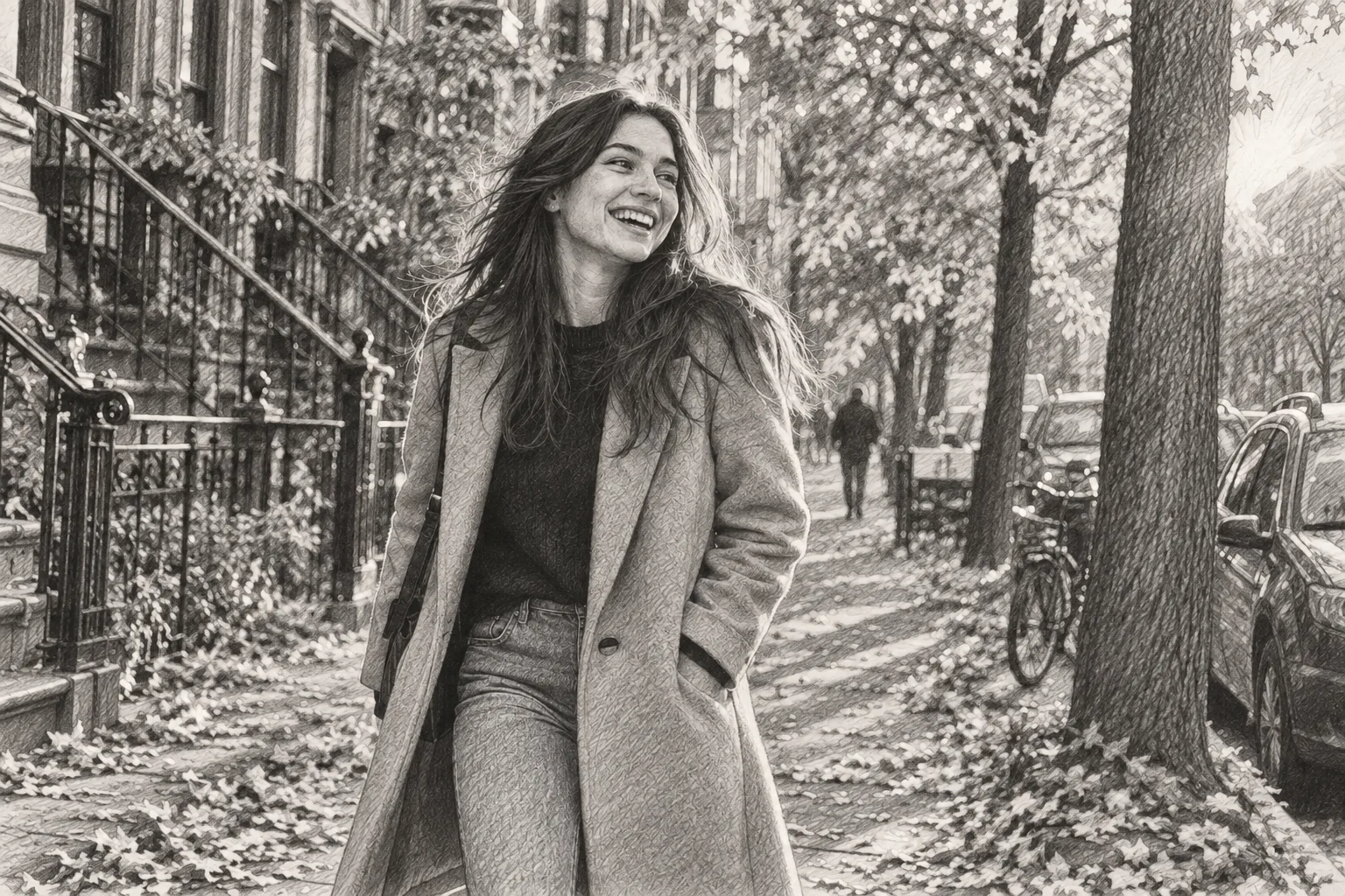
A photo style is easier to choose when you know what you want to keep. Is it the expression on a face, the color of a place, or the outline of a building? Start with that detail, then compare a drawing with a painted version.
Compare one photo before choosing a style
These examples use the same autumn portrait. Look at the shadows around the face, the edges of the clothing and the amount of background detail. The aim is to find an interpretation you like; a generated result can change small features and will not reproduce an example exactly.
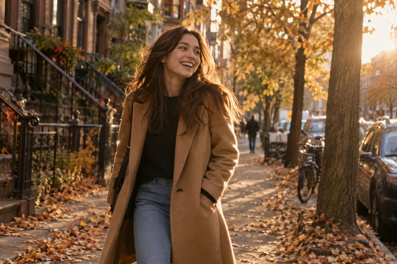
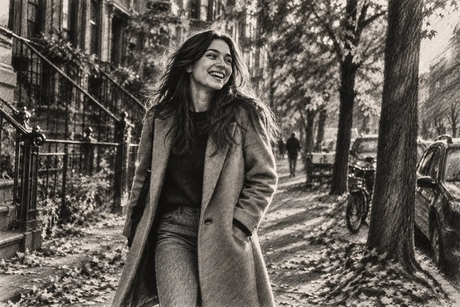
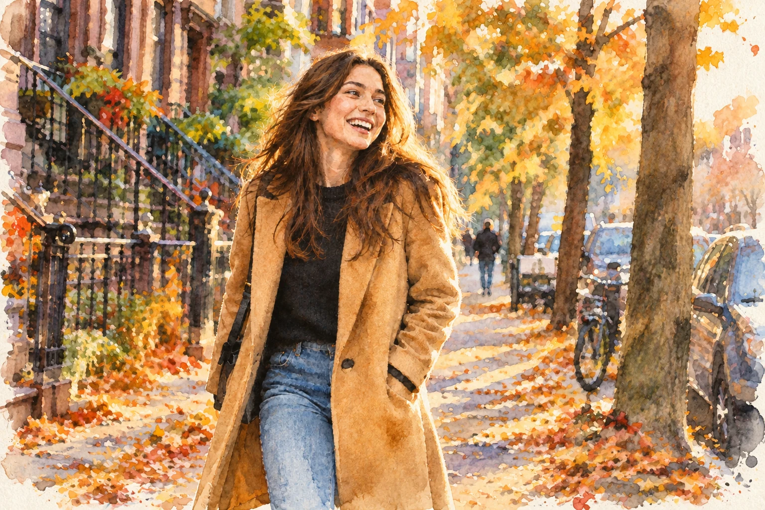
Choose a sketch for lines and contrast
Pencil and graphite are useful starting points for a portrait with gentle shading. In the examples, charcoal has stronger dark areas and softer edges, while ink puts more emphasis on the outline. Look beyond the style name: compare the treatment of hair, eyes and the background.
The photo-to-sketch creator has eight effects and examples for different subjects. A clear pet photo can be a good subject too. If the original is very dark or crowded, important details may become harder to separate when the image is simplified.
Choose oil for a painted surface
Oil effects emphasize brushwork and color. A landscape can feel more textured, while a portrait can take on a more traditional painted treatment. VFilter's oil painting examples let you compare portrait, landscape and other oil directions.
Try a style with the level of detail you want. More expressive brushwork can reshape small features; a textured result should not be treated as an exact record of the original scene.
Choose watercolor for a softer interpretation
Watercolor effects use softer boundaries and washes of color in the examples. Compare a loose treatment with a more detailed one before deciding. Flowers, travel scenes and pets give you different details to look at, from delicate stems to larger areas of color.
The painting creator brings oil and watercolor together in 11 styles. Use it to compare the two media without mistaking watercolor for an additional standalone tool.
Prepare the photo and review the cost
- Pick a photo with a clear subject and enough visible detail. Avoid a tiny crop or heavy blur.
- Open the matching creator and compare its available styles and examples.
- Upload your photo and select a style. Check the credit cost shown before generating; choosing an example is a separate step from submitting a generation.
- Review the result before downloading. Check facial details, hands, text and background objects if they matter to your picture.
Changing the source photo can help more than repeatedly changing the style when the subject is unclear. Keep the original so you can compare the result with what you intended to preserve.
Where to go next
Use the art style guide for side-by-side choices. If you want an illustrated character instead of an art-material effect, read anime versus cartoon photo styles. For credit packs and subscriptions, check VFilter pricing.